In commemoration of the 100th anniversary of the 19th amendment, which granted women the right to vote, I created an interactive online exhibition for our university gallery, which was at that time closed due to COVID. The gallery closure gave us the opportunity to create web-based exhibitions, such as this one. The exhibition can be viewed at https://gannettgallery.org/suffrage/exhibit/, and this article describes the work along with the design rationale behind it. The work was done in collaboration with the Oneida County History Center, who provided content materials including archival newspaper clippings, and in consultation with a local historian at SUNY Polytechnic, Kristina Boylan.
The exhibition consists of a single timeline with selected key dates on which important events leading up to suffrage took place. The dates and events were selected with a focus on activity taking place in our region of upstate New York, which was one of the hubs of the movement.
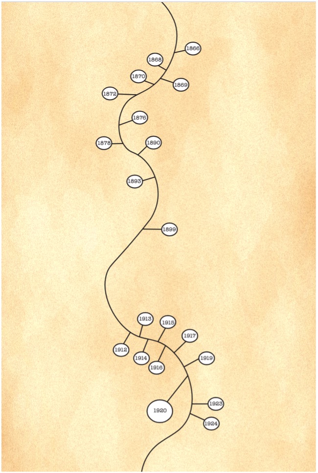
Figure 1: Screenshot of a section of the timeline.
The overall shape of the timeline, shown in Figure 1, uses the visual metaphor of a long and winding path to implicitly convey the notion that historical developments are not linear. The path extends beyond 1920 to highlight the notion that the story of suffrage did not end with the 19th amendment. Events beyond 1920 that are highlighted on this timeline include the Indian Citizenship Act in 1924 (which granted Native Americans citizenship), the Magnuson Act in 1943 (which granted Chinese residents the right to citizenship), and the Voting Rights Act in 1965 (which prohibited states and localities from imposing barriers to voting). While I did not add any events beyond the Voting Rights Act in 1965, the path extends beyond this date, suggesting that the story goes on. The dates on the timeline are spaced out to scale, so that the viewer gets a clear sense of the amount of time that passed between events.
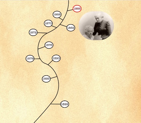
The page loads with an animation of the timeline unfolding to visually engage the user, and to hopefully encourage them to hover on or to click on the dates. The principle of progressive disclosure is applied here, where information is only revealed upon the user’s request. There is a challenging balance between overburdening the user with too much information at once and making the user work too hard to retrieve the information. Here I chose to let the user decide what they want to see, while being mindful that the user needs to be enticed and rewarded for interacting with the work. To motivate the user to click on a date, there is a hover feature on each date, where the date is highlighted and an image pops up, as shown in Figure 2. A casual non-committed user can wave their mouse over the page to see different images pop up over each date, and this will hopefully pique their curiosity.
Figure 2: Screenshot of a user hovering over the date ‘1866’. On hover, a portion of an image is revealed. Here, we see a photo of Elizabeth Cady Stanton and Susan B. Anthony, who in 1866 formed the American Equal Rights Association, which was dedicated to the goal of universal suffrage.
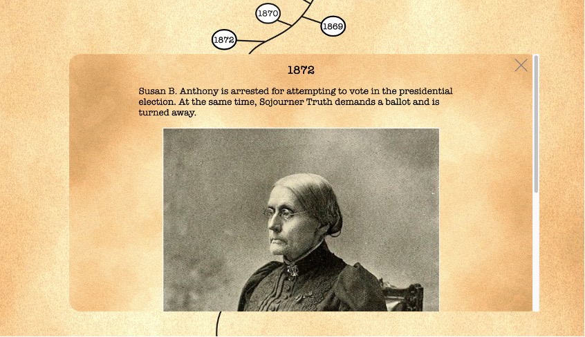
When a user clicks on a date, a window opens to reveal the event (or events) that occurred on the selected date, as shown in Figure 3. The user can either click on the close button or anywhere outside the window to close it.
Figure 3: Screenshot of a user clicking on the date “1872”.
The background, font, and colors were chosen carefully to convey the sense of time passed. The background was created to simulate old weathered paper. The overall color scheme is neutral and compatible with the sepia tone of old photographs. I chose American Typewriter font, which is based on the typeface of typewriters.
I hope that you will enjoy this work and consider using it to complement instructional materials. Please feel free to contact me with any questions and feedback.
Biography:
Ana Jofre is a designer, artist, and interdisciplinary scholar at SUNY Polytechnic Institute. As a designer specializing in web development and data visualization, she is particularly passionate about making academic work accessible to a wide general audience. Her academic life began as a physicist but she was compelled to instead pursue art and design by a desire for intellectual breadth. As a consequence, her research and projects transcend multiple disciplines. Her current projects include a cultural analytic deep dive into the archives of Time magazine (1923-2014), and the design of an interactive tabletop interface for data visualization. More projects can be viewed at her website: https://onewomancaravan.net/